Monday, November 30, 2015

MARGOT ZEMACH


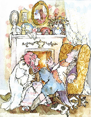
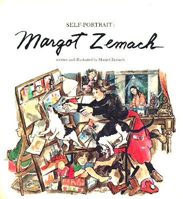
I have been eagerly waiting for November so I can blog about the illustrator Margot Zemach, who was born on November 30, 1931.
Zemach had an incredibly wacky and wonderful sense of visual humor---perhaps more fully developed than any other illustrator I can think of. To me, this reflects her understanding that no matter how hard we try to maintain our dignity, life is ultimately messy and even ridiculous.

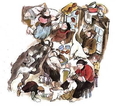
Illustration from "It could Be Worse"
Her humor was always about everyday, the ordinary foibles of life. 
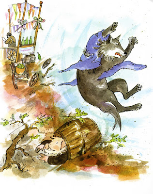
Illustration from "The Three Little Pigs"

If anything could possibly go wrong in her illustrated world, it did. She was a genius at depicting the embarrassing and all-too-frequent moments that make us, animals and humans alike, look foolish. Yet her art was always kind and loving---never cruel.
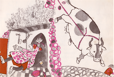
Illustration from "The Three Sillies"
In her earliest work, when books were still being printed with only two or three colors, her keen sense of the humor of life was already present.
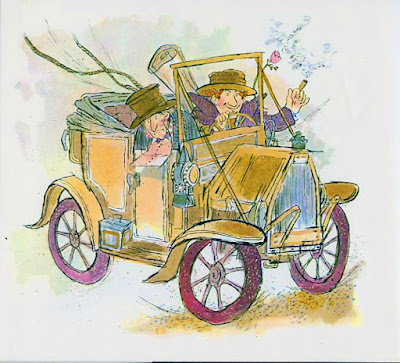
Illustration from "A Penny A Look"
I haven't even begun to talk about her skill as a visual artist. Her line vibrates with life. Her color is sophisticated, appealing, and often unexpected, yet is always in service to the story the art is telling---never a show-off. The seeming looseness and sloppiness of her work is deceiving. It takes a genius to create art of such vigor, life, and joy that it practically leaps off the page.
Illustration from "Duffy And The Devil"
I think of Margot Zemach as one of the greatest children's book illustrators of the century. The tragedy is that she died in 1989 at the age of 57, of Lou Gehrig's disease (amyotrophic lateral sclerosis). She was then at an impressive level of achievement, and probably would have gone even higher if she had lived longer. The greatest tribute we can give her is to find her books, read them, and share them with others.

https://en.wikipedia.org/wiki/Margot_Zemach

Sunday, November 29, 2015

EXPECTATIONS

This is what my studio looked like after I had spent several days creating what I originally thought would be a tidy, couple-of-hours-project: a simple 5 x 7 promotional postcard.
On the other hand...I haven't been able to face the set-up of my new printer ever since it arrived last week, because setting up computer and internet-related devices always becomes a long, hideous nightmare for me. I was dreading going through that ordeal once again. But today I realized I had to tackle the printer, no matter what. After all, I couldn't just leave it in its box forever. If nothing else, it was in the way. (Notice that bulky box in the lower-left corner of my first photo?)
The results? I've now completed the printer set-up in less than an hour. With no complications whatsoever. Life continues to astonish me.

Tuesday, November 3, 2015

BOOKPLATE

Occasionally I am offered a small, non-book illustration job. This memorial bookplate was one of those small jobs, and as always, I enjoyed the change of pace and the creative freedom that it gave me. The only restrictions I was given were the dimensions of the bookplate, and the text that was to be included.
Initially I came up with this very rough composition. The blue line indicates the outside dimensions of the plate. My sketches, if left to their own devices, would always be very rough---even sloppy, by today's standards. I never like to get very detailed in a sketch. For me, laboring over a sketch and filling in all the details at that stage takes away from the spontaneity and liveliness of the finished art. It's hard to believe this now, but many years earlier in my career, I sometimes did not even send sketches to an editor before going ahead with finished art. Publishing has changed dramatically since those days! At any rate, I knew that my finished bookplate art would be much more refined than my sketch...
...but my client was not as comfortable. So I made a new sketch, very clear, defined, detailed. (Again, by my standards. Many artists make sketches that are far more detailed and finished than mine.) I felt there was too much empty, unused space around the children's legs in the first sketch---a little boring. So I made the dog larger and sat him on the floor instead of on the bench; and I added the two mice. In the old days, these are changes that I would have made as I was preparing my work surface and laying out the composition in pencil, in preparation for painting and inking; the only difference then was that I would not have created an additional, separate sketch. And the refinements would have happened as I was actually inking. To me, that is the joy of creating. If I have worked out every detail ahead of time, then the inking and painting are, for me, simply copying, not creating. 

So my client was now comfortable with the sketch...
...and I could proceed with the finished art. I did not end up hand-lettering the text, as I had suggested. Instead it was added as type by the client. Again, in this day and age, the hand-lettering was probably just too "hand-made" in its appearance. Bookplate---a very satisfying job for me, and a nice change from book illustration.