Tuesday, October 24, 2017

CREATING MISS MUFFET

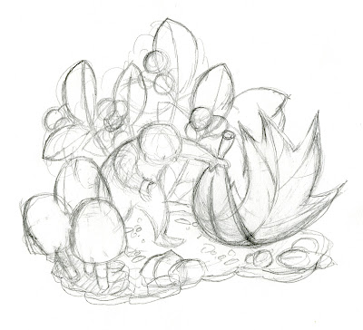
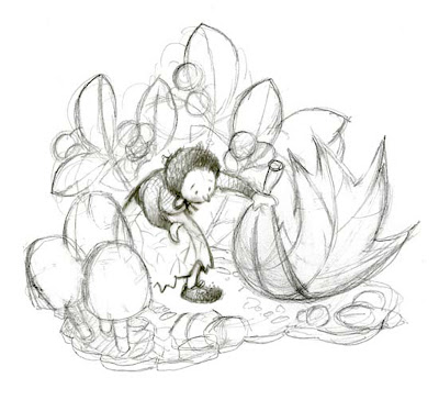
I recently created an experimental piece that was inspired by a character in a colleague's manuscript. I began as usual with one of my "rag doll" figures, roughing in the character's pose, and the physical setting.
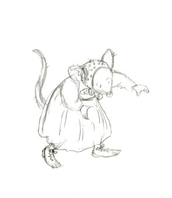
My next question was, what does this little Miss Muffet look like? I tried her first as a mouse. That didn't feel satisfying.  
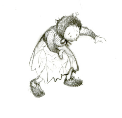
I tried her again as a little humanoid. She immediately came to life for me!
Although I usually create my art using only pencil, pen, inks, paints, and paper, this time I turned to my computer for some of the steps.  Here, I've scanned both Miss Muffet and the original sketch, and then replaced the rag doll figure with the Miss Muffet figure, using Photoshop.

I printed out the sketch, and worked on it further with pencil. The paper I used was an inferior grade of paper, which gave a slightly blurred effect that intrigued me. I often use an inferior paper when experimenting and trying out new ideas. It seems to free me up from any worry about "wasting expensive paper," and it allows me to make as many false turns as I want or need. Inferior paper also often gives unexpected results, as here, which I can later use deliberately in creating a piece.
I scanned and printed out the reworked sketch, and colored it with watercolors. Scanning and printing out the sketch obviously gave me the possibility of easily making several trials, experimenting with different palettes, and even different media, for the color.  Rescanning and printing out on the inferior paper also gave a pleasing blurred effect to the whole piece.
I liked my little Miss Muffet enough to put her on my most recent promotional postcard. Even as I publish this post, she is winging her way across the country to my list of art directors and editors. Bon voyage, Miss Muffet!


Tuesday, June 20, 2017

WHY WRITE FOR CHILDREN?

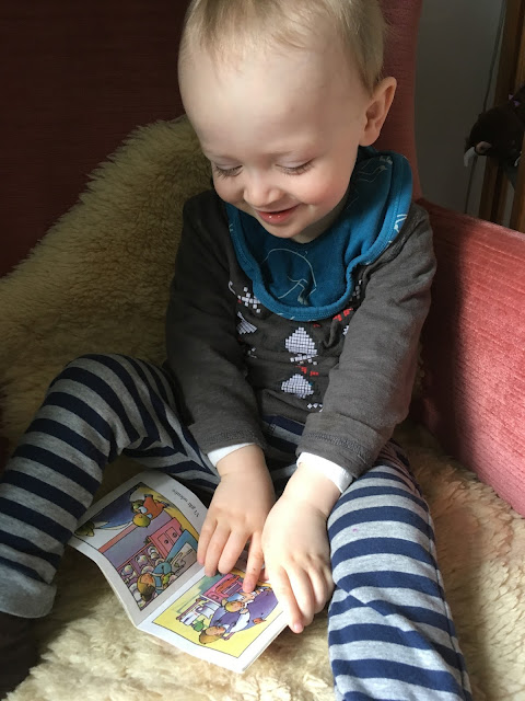
Photo of a fan with "Jakob Jakobsen", the Danish edition of my book "Jamie's Story." 
This very young man hasn't yet learned to email, so it's his mother who sent me this photo, and told me how much he loves this book. (And yes, she gave me permission to use it in this post.) Over the years, many adults have told me how much one of my books meant to them as a child. Perhaps this fan will also, one day, do the same. 
Is there any better reward for one's life work than this?

Thursday, June 8, 2017

MAGINEL WRIGHT ENRIGHT


Though I was very familiar with her visual work, I did not know the name of this American illustrator, Maginel Wright Enright, until doing research for June's illustrator birthday. And I was surprised to learn that she was the sister of the architect Frank Lloyd Wright.
Women's Home Companion
Enright was born on June 19, 1881, and died on April 18, 1966. She was a very productive illustrator, creating images for advertising...
...women's magazines...and educational publishers.


Her first venture into children's book illustration was for the series "The Twinkle Tales", which were written by Laura Bancroft.

From "The Twinkle Tales"---I don't know which volume
Laura Bancroft was in fact a pen name for Frank Baum, the author of "The Wizard of Oz" books! Another surprise as I researched this illustrator.

Enright's style matured as she went on to illustrate more than 60 books for children...


...including editions of "Hans Brinker, or, The Silver Skates"...


...and "Heidi".

The Market
Not all of her work was done in full color. This piece was created with just 3 colors, black, orange, and blue---the use of limited color being the custom for much of illustration during her time. The 3 colors are used together in varying percentages to create a palette with a variety of hue and strength.
An Enchanted Conversation
Enright's work certainly reflects the illustration styles popular during the early 1900's...
Babes In The Woods---created with just 2 colors, blue and black
...the years when she was producing most of her work.
  But Enright was no copyist or slave of fashion. Her work is strong, skillful, timeless, with a wonderful and easily recognized personality. Like many women artists, she is relatively unknown today. Let's honor her by looking for her illustrations as we browse used book stores, antique shops, and online auctions!


https://en.wikipedia.org/wiki/Maginel_Wright_Enright
https://en.wikipedia.org/wiki/Elizabeth_Enright
http://home.metrocast.net/~tortak/illustrators/Wright.html

Tuesday, May 30, 2017

ESSENCE

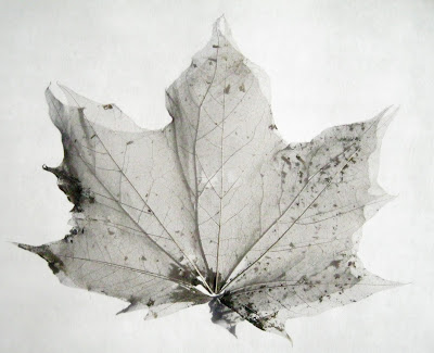
Out walking recently in this spring weather, I came upon a maple leaf that was lying on the sidewalk. It looked like a soggy bedraggled remnant from the previous fall.
But when I picked it up, I realized it was not a bedraggled and fragile remnant, but a piece of lace as delicate and resilient as a spider's web.
Like this leaf, we are pummeled, blown, washed, thrashed, frozen, and thawed, by time and life, until all extraneous matter is worn away, and only our enduring essence is left.

Tuesday, May 23, 2017

LEO LIONNI


Leo Lionni...author, illustrator, designer, art director, multi-talented creator...was born in the Netherlands on May 5, 1910, and died October 11, 1999 in Italy. He studied and worked as a painter and in advertising in Italy; then from about 1939 to 1962 he lived in the US, where he worked as a prominent advertising artist and art director.
Ad art for Container Corporation of America
His body of work exhibits an astounding versatility.
Fortune Magazine was one of his biggest clients.
Ad for Olivetti Typewriter
His work was often a startling break from the realistic images... 
Art for Colored Paper ad
...that dominated much of advertising at the time.
It would take a book-length post to cover all of the diversity and extraordinary vision this artist displayed in his work.
It wasn't until Lionni moved back to Italy around 1962 that he turned to the creation of children's books. By this time he had already honed his art to an exceptionally high level...
...and he brought all of that training, skill, and power, undiminished, to this new-to-him field.
Illustration from "Fish Is Fish"
The control, confidence, strength of his illustrations---and the whimsy, freedom, imagination, and child-like accessibility---burst forth from every page of his books.
Illustration from "Frederick"
So simple, so full of color (even in grays and neutrals)---so full of wit, joy, and energy---
Illustration from "It's Mine"
---art of this caliber in children's books is hard to find. A discussion of Lionni's storytelling gifts would fill yet more posts. I hope you will use the links below to find out more about this wonderful artist.


http://todaysinspiration.blogspot.com/2009/09/cover-story-fortune-magazine.html

http://www.printmag.com/daily-heller/designers-who-play-with-colored-paper/

https://en.wikipedia.org/wiki/Leo_Lionni

http://www.randomhousekids.com/brand/leo-lionni/about-leo-lionni/

Wednesday, May 17, 2017

PROMISE


Hope is emerging wherever I look.

Buds, springing from bare branches...
...expand gently, floret by floret...
...into full-blown racemes.
Ideas, too, seem to spontaneously bud...
...open up...
...spread wide their petals into the complete and fragrant vision.
Later will come the fruit.

Monday, April 24, 2017

BACK TO THE SOURCE


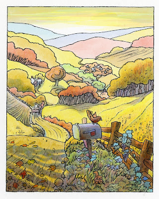
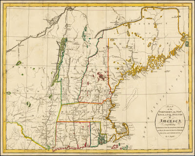
 So much of my work has been inspired by, based on, drawn from, New England---the New England I grew up in, and also lived in for many years as an adult.


 The landscapes and life-styles...


... the details of the smallest flowers, fruits, and seeds...


...the inhabitants, large and small---all are part of my very core essence.

After many years living in the Southwest, with very few excursions back to New England, it is time for me to return to my roots for an extended visit. And though much has changed---there, and in the world at large---I hope to find that some of the old landscape, some of the old creature friends of my childhood, some of the old life there, exists still. 

New England, here I come!