Thursday, December 31, 2015

LEONARD WEISGARD

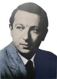
Leonard Weisgard, born December 13, 1916, was an American-born illustrator and author of children's books.


When he first began working, children's books in this country were still being illustrated with pre-separated, two or three-color art.
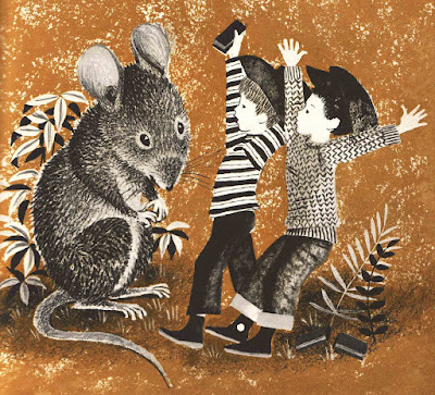
 
The Mouse And The Lion

Today our first thought might be, "Only two colors? How limiting!" But a perusal of the two-color art from the prominent illustrators of Weisgard's era quickly forces us to rethink our assumptions.
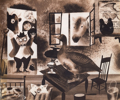
The Clean Pig

Could there be any more "color" in a full-color piece than there is in this illustration of Weisgard's?


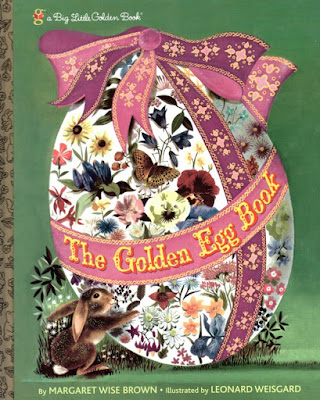
Weisgard did go on to illustrate many children's books in full color. The beautifully soft illustrations in "The Golden Egg Book" have always been amongst my favorites.
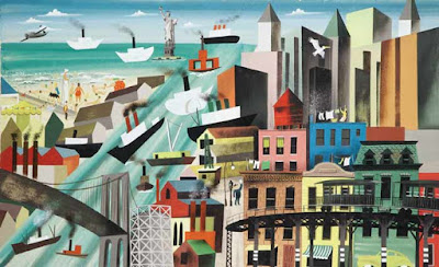
Pelican Here, Pelican There

Other styles Weisgard employed reflect clearly the influences and trends in the art of his day. In fact, tracing the history of children's book illustration can be one way of tracing the development and evolution of the art of any modern era.
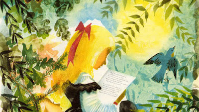
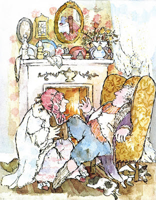
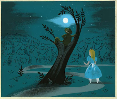
Alice In Wonderland

Whatever style and media Weisgard used, his work was distinct, totally recognizeable as his own and no one else's...


...so full of color, so full of emotion and warmth, so enticing and accessible and irresistible---inviting the viewer to jump into his world and become completely immersed.

Like many other illustrators, Weisgard did not confine his work to children's books. There is a lovely website about him, created by his children, as well as a couple of other sites, all of which give the public more online information than is often available for artists from the earlier 1900's. Do check these out and enjoy more of Weisgard's gorgeous art.

http://leonardweisgard.com

Tuesday, December 22, 2015

SOLSTICE

The Doll's Christmas Tree
The year darkens, then lightens...the tides ebb and flow...the moon waxes and wanes...likewise does the creative drive fluctuate from day to day, month to month, year to year. If we are willing to listen, the universe will teach us: to work with these immutable cycles, not against them.

Tuesday, December 15, 2015

NO LINES!

So much of my work combines line with color and tone. I've recently challenged myself with a new assignment: create images, either in color or black-and-white, using no lines. NO LINES ALLOWED.
(At least, no lines allowed in the final. I wouldn't know how to compose without using lines.) I began with the scenery for this particular image. Every artist has his or her own method. If the background and scenery for an image has any complexity, I like to work that out first. It's like creating the stage set.
Then I add the figures. I can easily place them, choreograph them, rearrange them, however I like. As usual, I put each element or figure on a different layer of transparent vellum, making it easy to shift positions. This eliminates the need to re-draw...re-draw...re-draw. As I've said so often, this is exactly the same process one would use with, say, Photoshop on the computer---working in layers. I just happen to prefer creating the layers with a pencil and paper.
After some experimentation, I decided to execute this composition in pencil on vellum---a surface that has a nice tooth for pencil. (Working surfaces being pricey, I did my experimenting on a partially used piece of vellum---the outlines of a lawn chair that you see are from another project.) I also tried a couple of different pencils before settling on a Koh-i-noor Kunstlerqualitat Negro #3, a tool that I have loved for years. (This pencil is no longer manufactured. Fortunately for me, I stocked up on them years ago, and figure I have enough for the rest of my lifetime---and perhaps beyond.)
Because this was a relatively new way for me to work, I kept pieces of scratch paper next to me, and experimented frequently with ways to handle various parts of the drawing. A foot coming at you, seen slightly from below, is always tricky for me.
The finished drawing. I decided not to use the checkerboard pattern on the floor that I had originally visualized. Too complicated, it seemed, for the very simple approach that had evolved.
I decided to use the final drawing for one of my promotional postcards, so I drew a little fir twig in the same style for a decoration.
The finished postcard. My experimentation gave me a double return: a new technique that I might use in a future illustration job---and a promotional piece for December.

Tuesday, December 8, 2015

CHAOS

I never seem to be embarrassed to let people see how messy my studio becomes. I think it's because I am always awed and amazed at the way a beautiful object is created out of such chaos. An object that one can pick up, hold in one's hands, peruse, read, enjoy. The process seems to me---still, after all these years---nothing less than miraculous. It confirms for me, over and over, my sense that I am the channel for the creating power, not the source.
I do clean and straighten my studio after each project is completed. A moment of stasis.
Then begins the next project---the next round of chaos. Out of which, yet again, will emerge a thing of beauty. 

And thus the magnificent cycle continues.

Monday, November 30, 2015

MARGOT ZEMACH


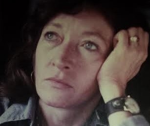
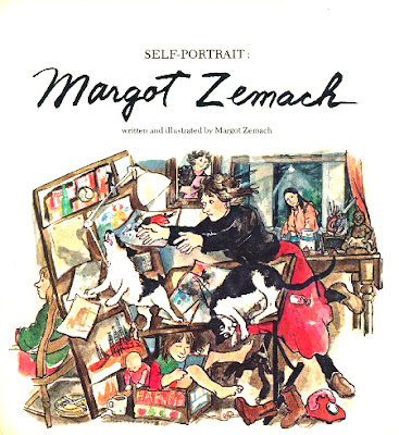
I have been eagerly waiting for November so I can blog about the illustrator Margot Zemach, who was born on November 30, 1931.
Zemach had an incredibly wacky and wonderful sense of visual humor---perhaps more fully developed than any other illustrator I can think of. To me, this reflects her understanding that no matter how hard we try to maintain our dignity, life is ultimately messy and even ridiculous.

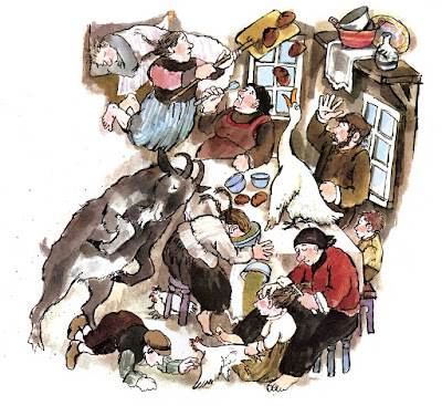
Illustration from "It could Be Worse"
Her humor was always about everyday, the ordinary foibles of life. 
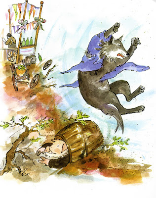
Illustration from "The Three Little Pigs"

If anything could possibly go wrong in her illustrated world, it did. She was a genius at depicting the embarrassing and all-too-frequent moments that make us, animals and humans alike, look foolish. Yet her art was always kind and loving---never cruel.
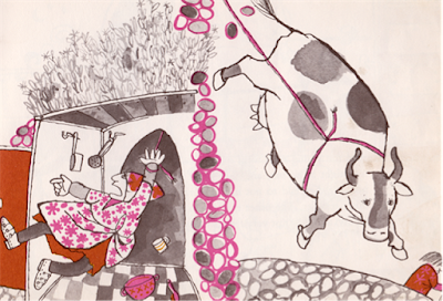
Illustration from "The Three Sillies"
In her earliest work, when books were still being printed with only two or three colors, her keen sense of the humor of life was already present.
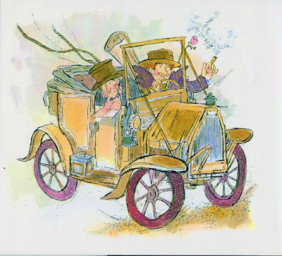
Illustration from "A Penny A Look"
I haven't even begun to talk about her skill as a visual artist. Her line vibrates with life. Her color is sophisticated, appealing, and often unexpected, yet is always in service to the story the art is telling---never a show-off. The seeming looseness and sloppiness of her work is deceiving. It takes a genius to create art of such vigor, life, and joy that it practically leaps off the page.
Illustration from "Duffy And The Devil"
I think of Margot Zemach as one of the greatest children's book illustrators of the century. The tragedy is that she died in 1989 at the age of 57, of Lou Gehrig's disease (amyotrophic lateral sclerosis). She was then at an impressive level of achievement, and probably would have gone even higher if she had lived longer. The greatest tribute we can give her is to find her books, read them, and share them with others.

https://en.wikipedia.org/wiki/Margot_Zemach

Sunday, November 29, 2015

EXPECTATIONS

This is what my studio looked like after I had spent several days creating what I originally thought would be a tidy, couple-of-hours-project: a simple 5 x 7 promotional postcard.
On the other hand...I haven't been able to face the set-up of my new printer ever since it arrived last week, because setting up computer and internet-related devices always becomes a long, hideous nightmare for me. I was dreading going through that ordeal once again. But today I realized I had to tackle the printer, no matter what. After all, I couldn't just leave it in its box forever. If nothing else, it was in the way. (Notice that bulky box in the lower-left corner of my first photo?)
The results? I've now completed the printer set-up in less than an hour. With no complications whatsoever. Life continues to astonish me.

Tuesday, November 3, 2015

BOOKPLATE

Occasionally I am offered a small, non-book illustration job. This memorial bookplate was one of those small jobs, and as always, I enjoyed the change of pace and the creative freedom that it gave me. The only restrictions I was given were the dimensions of the bookplate, and the text that was to be included.
Initially I came up with this very rough composition. The blue line indicates the outside dimensions of the plate. My sketches, if left to their own devices, would always be very rough---even sloppy, by today's standards. I never like to get very detailed in a sketch. For me, laboring over a sketch and filling in all the details at that stage takes away from the spontaneity and liveliness of the finished art. It's hard to believe this now, but many years earlier in my career, I sometimes did not even send sketches to an editor before going ahead with finished art. Publishing has changed dramatically since those days! At any rate, I knew that my finished bookplate art would be much more refined than my sketch...
...but my client was not as comfortable. So I made a new sketch, very clear, defined, detailed. (Again, by my standards. Many artists make sketches that are far more detailed and finished than mine.) I felt there was too much empty, unused space around the children's legs in the first sketch---a little boring. So I made the dog larger and sat him on the floor instead of on the bench; and I added the two mice. In the old days, these are changes that I would have made as I was preparing my work surface and laying out the composition in pencil, in preparation for painting and inking; the only difference then was that I would not have created an additional, separate sketch. And the refinements would have happened as I was actually inking. To me, that is the joy of creating. If I have worked out every detail ahead of time, then the inking and painting are, for me, simply copying, not creating. 

So my client was now comfortable with the sketch...
...and I could proceed with the finished art. I did not end up hand-lettering the text, as I had suggested. Instead it was added as type by the client. Again, in this day and age, the hand-lettering was probably just too "hand-made" in its appearance. Bookplate---a very satisfying job for me, and a nice change from book illustration.

Wednesday, October 14, 2015

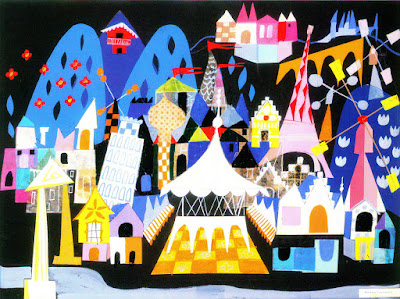
MARY BLAIR

Mary Blair was born Mary Robinson on October 21, 1911. I had never been aware of her name, until now. But her work---that I did know. And this might be the same for you.

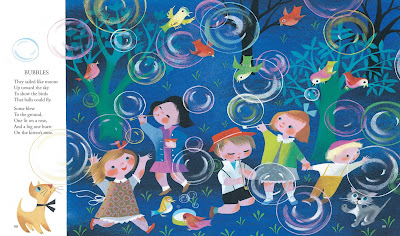
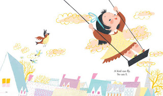
She was the illustrator of several children's books...
...some of which are still in print.

But in reading about her, it is very clear that her connection with Disney Studios is what gave her the room and the encouragement to so fully develop her art.


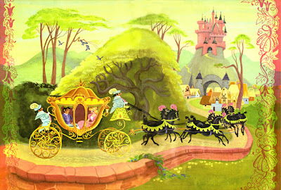
Everything she did exhibited such a love of color, such an air of excitement and energy---
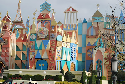
Buildings in a Disney World---don't know which one


---even in buildings! She is just another example of the unerring eye Walt Disney employed in his choice of artists. So many Disney artists from the 30's, 40's and 50's are among the brightest and best of our children's book illustrators.

 I often disagree with Disney plot lines and adaptations of traditional stories and fairy tales, but I must in all honesty acknowledge the great gift Disney gave the public through his support and employment of so many incredible visual artists. 

I hope you'll take a bit of time to read more about Mary Blair, and to look at her work online. I've only scratched the surface here. As for me, I would like to soak up some of her wildly uninhibited enthusiasm for color and form, and apply it to my own work.


https://en.wikipedia.org/wiki/Mary_Blair

http://www.waltdisney.org/mary-blair

http://www.huffingtonpost.com/2014/03/22/the-world-of-mary-blair_n_5003658.html

https://d23.com/walt-disney-legend/mary-blair/

Tuesday, October 13, 2015

PERSNICKETY

In a recent email with a colleague-friend , I described myself as "persnickety." He emailed back with the above. After examining this image, I decided that perhaps I should avoid being "persnickety." I'm sorry to come to that conclusion----the word rolls off the tongue in such a delightful manner. 

The moral? Don't be seduced by the superficiality of appearance or sound; it's the content that matters.

Friday, October 9, 2015

STEAM ENGINES

This is one of the double-page spreads I created for "The Cats In Krasinski Square", written by Karen Hesse, and published in 2004. It's a large piece, 24" wide, and executed in pencil, watercolor, and ink. The story was challenging to illustrate, set as it was in Warsaw, Poland, during WWII, and dealing with the hardships of Jews, both in and out of the Warsaw Ghetto.
Since the story was historical fiction, I relied heavily on photographs to construct my illustrations. When I had roughed out this composition, using xeroxes of photos and my own very rough figure sketches, I showed it to my dad, Aldren A Watson, the well-known illustrator who was my professional mentor until his death. Dad looked at my compostion for several minutes, clearly uncomfortable about SOMETHING. Finally he said, "You've got an American steam engine here, not a European steam engine." 
 As it happened, my father was not only a terrific artist, but an expert on old trains. (And just a note: I learned that American steam engines had cowcatchers at the front end; European engines had bumpers.) He sent me sketches, photos, and books of European steam engines, as well as historical information about the manufacturers of steam engines, indicating which kind of engine was likely to have been in Warsaw in 1940. Thank goodness he caught this mistake---I'm not sure if anyone else would have seen it until it was too late.
I began to revise my sketch. It was hard to find photos clear enough for me to see all the details of wheels, drive shafts, and other mechanical parts. "Just add a lot of steam" my Dad said. We artists know about "adding steam". Sometimes that's a cop-out; other times it's a practical solution. As my son always said about film and the stage (and equally applicable to illustration): "We're creating an illusion of reality, not reality itself."
On a separate transparent layer I next worked out very carefully the arrangement of the clouds and steam behind the engine.The separate layer avoids messing up any drawing on other sections of the compositions.
Next came the figures of the pursuers...
...and of the pursued.
I combined all these layers into my master sketch. I carry out this process with transparent vellum, but the process is exactly the same if one is doing it on a computer.
And voila (after 4 days of painting and inking)---the finished illustration.