Monday, April 30, 2012

PICTURE BOOK DESIGN: SHAPE AND SIZE

The dimensions and shape of a picture book can vary---but within a fairly narrow range. It  can have a horizontal format...
...a vertical format...
...or a squarish format.  (As always, there are exceptions---for example shape books, which have die-cut, non-rectangular silhouettes.)
Those working with picture books usually talk about their trim size, which is the size of the page.  The physical book is a bit larger, as the hard cover extends slightly beyond the page on all four sides.  The minimum trim size in today's publishing world would be a 9  x  9 inch square, or an 8  x  10 rectangle. A publisher probably would not produce a picture book smaller than this, for fear that it would get lost amidst the competition---literally covered up by larger books in the bookstore display, for example. 

But in spite of today's philosophy of "Bigger is Better", there is an upper limit to the size of picture books.  We need to be able to physically hold them and read them, aloud or to ourselves, with ease and comfort.  The books need to fit onto the shelves of libraries and households.  And over-sized books are more costly for the publisher to produce.  So the maximum trim size generally would be an 11  x  11 inch square, or a rectangle with a maximum 11 inches on the longest side, such as 9  x  11 or 10  x  11.  (When I was researching all this recently at my local independent bookstore CHANGING HANDS (http://www.changinghands.com/) I saw one exception to this upper limit: a book with a 10 1/2  x  12 horizontal format---and a celebrity name on its cover.)

Within these parameters, an illustrator would seemingly have unlimited choices---for example, she/he could ask for a  trim size of 9 1/4   x   10 7/8.  But the final decision will actually be made by the publisher, though hopefully in consultation with the illustrator. Since the book will be printed on very large sheets of paper (with one complete printed picture book fitted onto one sheet), and since various papers come in various sheet sizes, the sheet size of the paper will therefore determine the trim size of the book. And the choice of the paper itself will most likely be made by the publisher, based on the paper's characteristics, and its cost. 

Friday, April 27, 2012

PICTURE BOOK DESIGN: ONE WAY TO MAKE A DUMMY


There probably as as many ways to make a picture book dummy as there are illustrators and authors.  This is how I make mine. 
    I usually work out my composition sketches with tracing paper and scanned print-outs---cutting, taping, re-sizing, re-printing, re-taping---so I need a hard, smooth dummy paper that will stand up to the wear and tear.  
For many years I've been using "Borden & Riley's #234 Paris Bleedproof Paper for Pens".  It's not terribly expensive, and it comes in a 19" x 24" size pad, which is usually big enough for whatever book I'm working on.  (If I'm working on a larger book, I purchase over-sized loose sheets of a similar type of paper from my local art store.)  Using the dimensions I've decided on for the dummy, I make a tiny diagram for myself showing the measurements of the paper I need to cut.  I ALWAYS make this diagram before cutting.  It prevents those awful experiences in which, after cutting all the paper, one discovers that it's just half an inch too small.
I will need 8 pieces of paper that are the height of the finished dummy, and twice its width.  Perhaps the finished dummy is going to be 11 inches wide by 9 inches tall---see diagram above.
I will therefore need 8 pieces of paper that are 22 inches wide (twice the finished width of 11 inches) by 9 inches top to bottom. 
But not quite.  Since I am persnickety about details, and can't stand having an uneven front edge to the dummy, I add approximately 1 inch (the amount does not need to be exact) to the width of the paper.
After cutting the paper, I stack it carefully into a neat a pile, and fold it, all together, in half.  The front edges do not align at this step, nor is it possible to make them do so.
I smooth down the fold several times as hard as possible with a bone smoother.  You can also use the back of a large plastic spoon, for example, for this. Then I staple or sew the pages together, through the center fold.
Fastening through the center fold allows the dummy to open completely and lie flat as I work on it.
After sewing, I close the dummy back up and crease the fold again several times, hard, with the smoother. Then I measure the desired dimension from spine/fold to front edge (in this case it would be the 11" width) and trim off the excess paper, all at once. No uneven front edge!   Starting with the front of the dummy, I number the pages, 1 to 32.  
   The dummy is now ready for use.


Thursday, April 26, 2012

PICTURE BOOK DESIGN: MANUSCRIPT STRUCTURE FLAWS


Careful analysis and paging of a picture book manuscript is an important step toward presenting the text visually to its best advantage.  This process also helps the illustrator to pinpoint, and compensate for, any structural weaknesses in the text.  It can even enable the illustrator to turn a minimal text into a full-length picture book.  I'll choose "Humpty Dumpty" as an example of this last.

Humpty Dumpty sat on a wall
Humpty Dumpty had a great fall
    All the King's horses
    And all the King's men
Couldn't put Humpty together again

As usual, I look in this text for 5 critical points (see my blog http://thewendywatsonblog.blogspot.com/2012/04/picture-book-design-analyzing.html): setting the scene; the story begins; the final crisis; the final resolution; and the wind-down.

My take on "Humpty Dumpty" is that several segments of the necessary structure are missing.  There is no "setting the scene"---with the very first words of text, the story is already in full swing.  Humpty Dumpty has already taken action: he sat on a wall.  If this were the beginning of an actual picture book, I would wonder:  Why did he do that?  I  can identify the final crisis---despite many attempts by all the king's men, Humpty is still in pieces.  But there is no final resolution, and no wind-down.  Again, if the text were parcelled out, as is, into a picture book, and I came to the last page and read "couldn't put Humpty together again.  The End" I would wonder: Is that it?  That's the end?  So my assessment is that the text, as it stands, is only an anecdote, not a story with a beginning, middle, and end.  

Can I, the illustrator, extend this truncated text enough to support a full-length picture book?  I would need, first of all, to flesh out the rest of the story in my mind.  What IS the setting?  What is Humpty Dumpty's life normally like?  And what then leads him---or forces him---to climb up onto a wall?  This part of the story I would then portray through pictures alone, on the very first pages of the book---the half title, title, and dedication, probably.  On the first spread of the actual body of the book I would place the first words of the text with its accompanying illustration:  "Humpty Dumpty sat..."  Word balloons with my own additional dialogue could add to the story-telling.

And at the end, what is the final resolution?  What happens after the the King's men fail to repair the broken Humpty?  Is Humpty then turned into an omelette?  Or is he repaired after all in some miraculous fashion?  I would need, also, to create a wind-down.  The towns-folk, comfortably full, settling in for a nice nap after devouring the Humpty-omelette?  Or the re-born Humpty, happily restored to a life in which he'll act perhaps more wisely---or perhaps even more foolishly?

As at the beginning of the book, I'd tell the story of these segments through wordless illustrations that would occupy the two or three final spreads of the book.  Thus the final words of the verse "...couldn't put Humpty together again" I'd place perhaps on spread 10, leaving spreads 11 and 12 for the wordless illustrations that would finish up the story.

Humpty Dumpty is an extreme example of a text whose structure needs assistance. But the process I've outlined demonstrates one of the most helpful techniques that an illustrator can bring to any picture book manuscript.  

(The illustration is by the great Frederick Richardson, illustrator of the Classic Volland Edition of Mother Goose, with which I grew up.)


Friday, April 20, 2012

PICTURE BOOK DESIGN: MANUSCRIPT ANALYSIS, AN EXAMPLE


I'm restricted in this public blog by space and copyright considerations, so I'll use the text for THREE LITTLE KITTENS, which is short and in the public domain, for my demonstration of manuscript analysis.  Here's the text, broken up into the sections that I later talk about:
1)
Three little kittens

*****************************
2)
they lost their mittens,
And they began to cry:
Oh mother dear, we sadly fear
Our mittens we have lost.
What! Lost your mittens?  You naughty kittens!
Then you shall have no pie.
Mee-ow, mee-ow, mee-ow.
No, you shall have no pie.

The three little kittens, they found their mittens,
And they began to cry:
Oh mother dear, see here, see here,
Our mittens we have found.
Put on your mittens, you silly kittens,
And you shall have some pie.
Purr-r, purr-r, purr-r.
Yes, you shall have some pie.

The three little kittens put on their mittens
And soon ate up the pie.
Oh mother dear, we greatly fear
Our mittens we have soiled.
**********************************
3)
What!  Soiled your mittens?  You naughty kittens!
Then they began to sigh.
Mee-ow, mee-ow, mee-ow.
Then they began to sigh.
*********************************
4)
The three little kittens they washed their mittens
And hung them up to dry.
Oh mother dear, do you not hear
Our mittens we have washed.
What! Washed your mittens?  What good little kittens!
**********************************
5)
But I smell a rat close by.
Mee-ow, mee-ow, mee-ow.
Yes, I smell a rat close by.

I make my initial analysis using just the typed manuscript itself.  I'll refer by number to each section numbered in the above text.

1)  I first identify the part of the text that "sets the scene". With the THREE LITTLE KITTENS, I feel that by the time I reach "they lost their mittens," the story action has already begun. So in fact it is the simple phrase "Three little kittens" that sets the scene.  That is the text I would paste into the opening spread, spread 1.  (The actual scene that will be set here must of course be imagined and portrayed by me the illustrator.)

2)  I've already identified the phrase "they lost their mittens" as the point where the story begins, and I would make that the text for spread 2. Later, when dividing up the bulk of the story text, I might want to add a bit more of the text to this spread.  

I next look for the "final crisis", the "final resolution" and the "wind-down".  I usually work backward when identifying these segments.

5)   The 3 final lines beginning with "But I smell a rat close by" seem to me a perfect "wind-down", and I would make that the text for spread 12. 

4)  Spread 11, the final resolution, might have as its text the 5 lines beginning with "The three little kittens they washed their mittens." 

3)  Spread 10, the final crisis, might contain the 4 lines beginning with "What! Soiled your mittens? You naughty kittens!"

My next step would be to paste the text into my simple dummy, according to the opening and closing divisions I've made in the manuscript, and distributing the remainder of the text through the 7 spreads that are still blank. The text seems a little bland to me; I might decide to add some extra drama to the story, for example with a sub-plot that is portrayed through illustration alone.  But first I'll spend a fair amount of time just turning the dummy's pages, and reading its text aloud, over and over. Do the break-ups and pacing work the way I want them to?  If they do not feel solid and inevitable, then the rest of my work on the book will be built on a flimsy foundation.  

Thursday, April 19, 2012

PICTURE BOOK DESIGN: ANALYZING THE MANUSCRIPT


Analyzing the structure of the manuscript is, for me, one of the first and most important steps I take in illustrating a picture book.  This is not a complicated process.  I identify what is the opening section of the manuscript: the part that "sets the scene."  I pinpoint where the actual story begins:  when do things "start happening"?  Next: where are the final crisis and resolution?  Everything following that is the "wind-down."

The second part of my analysis is to distribute the text amongst the pages of a dummy, or mock-up, of the book.  At this early point my dummy is ultra simple: 8 pieces of 8 1/2 x 11 paper, folded in half and numbered.  I mark in the possible positions for front and back matter.  There will then be something like 12 double-page spreads available for the manuscript.
Out of 12 spreads, only 1, or possibly 2, of these can be used for "setting the scene."  The actual story must begin on spread 2 or 3.  Otherwise the reader will already be losing interest, wondering when something is ever going to "happen."  Likewise, at the other end of the book, the final crisis must happen on spread 10, the final resolution on spread 11, with the final spread 12 for the "wind-down."  After all, once the actual story is over, no one likes to hang around for a drawn-out good-bye.

The remainder of the text can then be divided up amongst spreads 4 or 5 through spread 9.  This gives 6 or 7 spreads total for the main body of the story. If a picture book manuscript has a slow beginning, a weak middle, or a tedious ending, such flaws will become glaringly obvious as one divides it up into a dummy.  This is why authors as well as illustrators benefit from putting a manuscript into a simple dummy like this.

My Disclaimer:  You will undoubtedly be able to find a successful book that is an exception to every comment and suggestion I make in these blogs about Picture Book Design.  In response: my comments and suggestions may not cover every possibility, but they will not lead you astray.

Wednesday, April 11, 2012

PICTURE BOOK DESIGN: MORE BASICS


How many pages does a picture book have?  Can the illustrator or author choose whatever length he or she wants?
Well, no.  A standard hardcover picture book contains 32 pages. The above diagram is the grid that many authors and illustrators start out with when working on a picture book. But how many of these pages are actually available for storytelling?  Much of that depends on what kind of endpapers (AKA endsheets, or ends) the book will have.
Some books have self-ends, which are part of the 32 pages, and are printed with art created by the illustrator.
The illustrator must reserve 8 of the 32 pages for self-ends as follows:  page 1 and page 32 will be pasted down to the boards; pages 2-3 and 30-31 will be printed with art; pages 4 and 29 will be (traditionally) left blank.  Thus page 5 will be the first page available, and page 28 will be the last page available, for storytelling---a total of 24 pages.  
And what if the ends will be separate ends---additional pages, of a colored or decorative paper?  
These ends will not be included in page numbering for the book, as shown above, and therefore the full complement of 1 through 32 pages will be available for story-telling. Right? 

 No, not quite.

There are two more elements that must be included in the book:  the title page, which is either a right-hand page, or a double page spread; and the copyright notice, which used to always be on the title page, or backing it; but which now is sometimes on the last page of the book.  There are also additional optional elements: a half title (the simpler, smaller title display that precedes the title page); the dedication; and sometimes an author's note.  At the discretion of the illustrator (and editor, designer, etc), the number of pages allotted to this front and back matter can vary from 2 or 3 pages, up to as many as 6.

Thus the number of pages available for actual story-telling could vary from as few as 18 pages, up to as many as 29 or 30.
The decision of how to handle the endpapers and front and back matter for BEDTIME BUNNIES was based, as is normal, partly on the publisher's budget for the book---for example, separate ends cost more.  In the case of this book, however, the cost of separate ends had been factored into the initial budget for book production.  Separate ends do give more room and freedom for the interior of the book, thus hopefully making the book more attractive to prospective buyers, and perhaps translating into more sales.   The decision was also based---again, as is normal---on editorial and creative choices.  For instance, in dividing up the text for this book, the story fell very naturally into 12 segments---12 double page spreads.  This left a few extra pages for a half title, and a whole double page spread for the dedication---though not enough extra pages for self-ends.  In other instances,  a smaller, slighter story might fall more comfortably into a smaller number of pages, in which case self ends would be appropriate.  A longer or more complicated story might need to spread out into every page it can get, squeezing a separate half title page or dedication page out of existence.

The above diagram shows the endpaper and front and back matter arrangement for BEDTIME BUNNIES.  There was a total of 24 pages available for the actual storytelling.  The story began on page 8, and ended on page 31.

In my next posts I'll be talking about analyzing the manuscript from the illustrator's point of view.

Monday, April 9, 2012

PICTURE BOOK DESIGN: BASICS


This summer I'll be teaching a 6-week class entitled Picture Book Design as part of the Children's Book Illustration Certificate program at Hollins University, in Roanoke, Virginia.  (Go to  http://www.hollins.edu/grad/cbi/index.htm   for more info about this exciting new program.)

As I prepare for this class, I'll be sharing some of my material in a series of blog posts with the same title, Picture Book Design.  The blog posts will of necessity be brief; I'll be covering this material much more intensely and in much greater depth with my students in my class this summer.

Today I'll start from scratch, with a few of the common terms that are used when talking about hardcover books, and hardcover picture books in particular.
A book has a front cover; a back cover; and a spine.  The hard covers are also known as boards.
There is usually a paper jacket, or dust jacket, that slips on over the book.  As with the boards, there is a jacket front; a jacket back; and a jacket spine.  The jacket also has a front flap, and a back flap, that tuck inside the book covers and hold the jacket in place.  Flaps usually contain blurbs, author/artist info, and other pertinent info about the book.  With picture books, the front and back jacket images and text usually repeat that found on the covers.
When we open the front or back cover of a hardback book, we see the endpapers.  There are two endpapers at the front of the book, and two at the back. One of the endpapers has been pasted down to the inside of the board.  The second endpaper faces it.  
     We call one piece of paper in a book a leaf.  One face or side of a leaf is a page.  When working with picture books, which are of such limited length, we number every page in the book, regardless of where the story actually begins.  
      To best illustrate this, imagine a piece of paper folded in half---this is the "book".
We now have page 1, page 2, page 3, and page 4.  The "story" in this book might begin on page 2, and end on page 3. Numbering picture book pages in this way allows everyone working on the book (author, artist, designer, printer) to be in sync as to exactly which page is under discussion. And given the physical construction of a picture book, left-hand pages are always even-numbered.  Right-hand pages are always odd-numbered. 
When we are working with picture books, we also often talk about double-page spreads, or simply spreads, which comprise two facing pages.

In my next post in this series, I'll cover some further basics about picture books.  Later posts will deal with analyzing a manuscript---its structure, mood, and rhythm---before getting into the nitty-gritty of composing and creating actual illustrations.

Wednesday, April 4, 2012

ARTISTS AND FOOD: MY GRANDFATHER


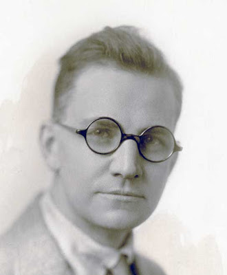
Ernest William Watson was a pencil artist, watercolorist, print maker, author, and teacher.  He co-founded Watson-Guptill Publications; the magazine, American Artist; and The Berkshire Summer School of Art, in Monterey, Massachusetts, one of the first summer art schools in the country.  (Click here for two of the many links for Ernest: http://www.americanlegacygallery.com/artistPage.php?aid=102&cid=6 OR http://americanart.si.edu/collections/search/artwork/results/page=1&num=10&image=0&view=0&name=&title=&keywords=&type=&subject=&number=&id=5255)
    Ernest was not content to simply practise his art.  It seemed to me his entire career demonstrated that, besides his passion for art and art-making, he had a tremendous desire to communicate and pass that passion on to others.  He continued that tradition with me. From the time I was a child, and I began to visit him in New York, he followed my artistic development with interest and encouragement; took me to the city's many museums; presented me with special books that he thought would interest and intrigue me.
     But he didn't stop at art.  On those visits he also gave me my first cup of tea.  Shared with me his love of blueberries.  Introduced me to crystallized ginger.
     And his impish humor shone through in all of our encounters. A ritual of my visit was always when, climbing up steep cramped stairs under the circus striped awning he had painted onto the ceiling, he would escort me and my suitcase to the guest bedroom.  Then he would throw open the door of the tiny adjacent bathroom and announce, "Don't mind her; she's just leaving."  Playing my part, I would peek inside and glimpse the pink backside of the Rubenesque nude, disappearing amidst clouds of steam behind a trompe l'oeil door, that my grandfather had rendered beautifully in classical style on the plaster wall. We continued this game through my very last visit with him.
  My father (Aldren Auld Watson, author of WATERFRONT NEW YORK: Images From the 1920s and 30s to be published by David R.Godine fall 2012) often told of how, when he was young, he and his father initiated a Saturday morning challenge for themselves:  together they would make biscuits for breakfast in as short a time as possible---and they would attempt each Saturday to beat their time from the week before. With my father's permission, I reproduce here his account, and his sketch, of one of those Saturday mornings:
Biscuits:  Rolled or Dropped
     Father pulls out his Hamilton railroad watch: "Five of seven Saturday morning; let's do it."
     I already did most of it---yesterday afternoon.  I had split a load of special kindling and thin firewood and filled the woodbox with it.  All bone-dry chestnut from those telephone poles.  Enough for two or three ordinary days.
     I nod, life off the left-hand stove lid, jab the cold ashes with the poker.  I wad up a couple sheets of newspaper, drop them into the firebox.  Then I build a criss-cross pile of kindling with skinny pieces of the chestnut about the thickness of your little finger, thicker ones on top.  Strike a wooden match, drop it into the pile, slide the stove lid back into place and open the damper to quick-start the draft.  Three minutes later shut the damper, add a handful of chestnut.  It snaps and crackles like firecrackers.
     Father is ahead of me, ahead of the fire, too.  All the makings are in the big brown crockery bowl and he's beating away with a wooden spoon.  I take a look and see that the oven needle is creeping up, 250 now.  Lift the front stove lid, shove in another bunch of chestnut sticks.  Fire is really popping.  The teakettle, always sitting on the back of the old Glenwood, starts to hum her tune.  Needle is almost touching 400 now, almost time.  Lift the lid, drop in six or seven sticks, clap the lid back in place.
     Father stands by, biscuit cutter in one hand, and in the other his cookie sheet with eighteen biscuit cutouts lined up on it.  I'm watching the oven door thermometer.  So is he.  The needle hits 450, and with the pot holder I grab the oven door, Father slides his cookie sheet onto the top rack, claps the door shut.
     "Seven fifteen," he says.  "Right on time."
     Every couple of minutes I lift the stove lid with my left hand, and with my right, quickly slide in a few thin sticks of chestnut, and quickly replace the lid.  I look at the oven door.  Just a whisker below 450.
     "Seven twenty-three," says Father.  The fire sounds like popcorn popping.  Father has to have a look.  He opens the oven door, glances inside, then pulls out the cookie sheet, looks at the Hamilton, and exclaims,
     "Thirty minutes, start to finish.  And golden brown, too!"

I don't know what recipe my grandfather used, so I include here my own favorite from my old JOY OF COOKING:

Buttermilk Biscuits

Sift before measuring: 1 3/4 c all-purpose flour (or 2 c cake flour), 1 tsp salt, 2 tsp baking powder, 1 tsp sugar, 1/2 tsp soda.  Cut in: 5 Tbls butter.  Add: 2/3 c to 3/4 c buttermilk. Mix very lightly, turn out onto floured board, knead very slightly and gently---only 5 - 6 turns.  Pat dough to thickness of 1/4 inch. Cut out. Bake 10-12 minutes at 450 degrees.

As I make biscuits---or art---I like to remember my grandfather's beliefs:

You can always improve
Food and art are both important
Have fun