Tuesday, December 30, 2014

TO CENSOR OR NOT TO CENSOR

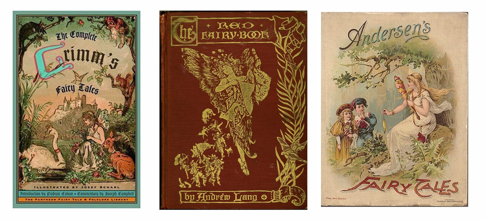
 I won't dive in to the deep waters of the discussion over whether to censor traditional fairy tales for young readers---whether to take out the gruesome or scary parts, whether to make sure they have morally correct endings, and so on. That discussion has been carried on by life-long students of literature, child development, mythologies, and the like; and it began with the very first publication of the Grimm's brothers collection in 1812---or even earlier. I would be in way over my head if I joined this group.
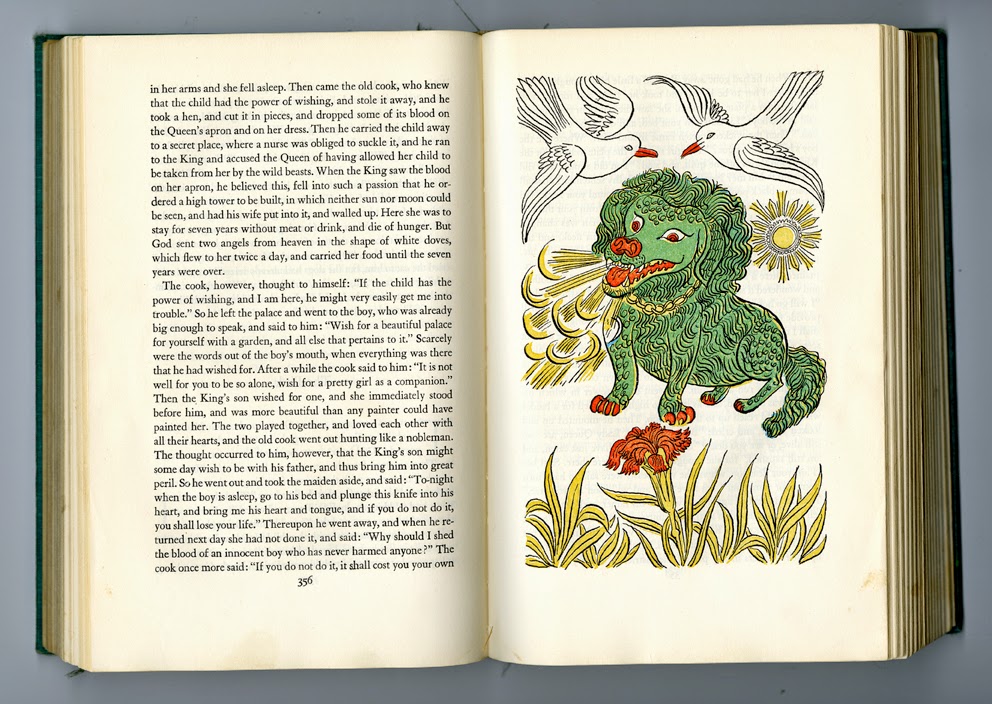
from "Grimm's Fairy Tales, Complete Edition, illustrated by Josef Scharl"
But I can dabble here in the shallows, and talk about my own experiences with fairy tales. 
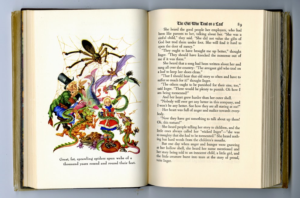
from "Andersen's Fairy Tales", illustrated by Arthur Szyk

As a child, I read voraciously. I took armfuls of the books I had chosen out of the public library; and I read and re-read the volumes that filled the bookshelves and cluttered the rooms in our home. Fairy tales were one of my main staples.
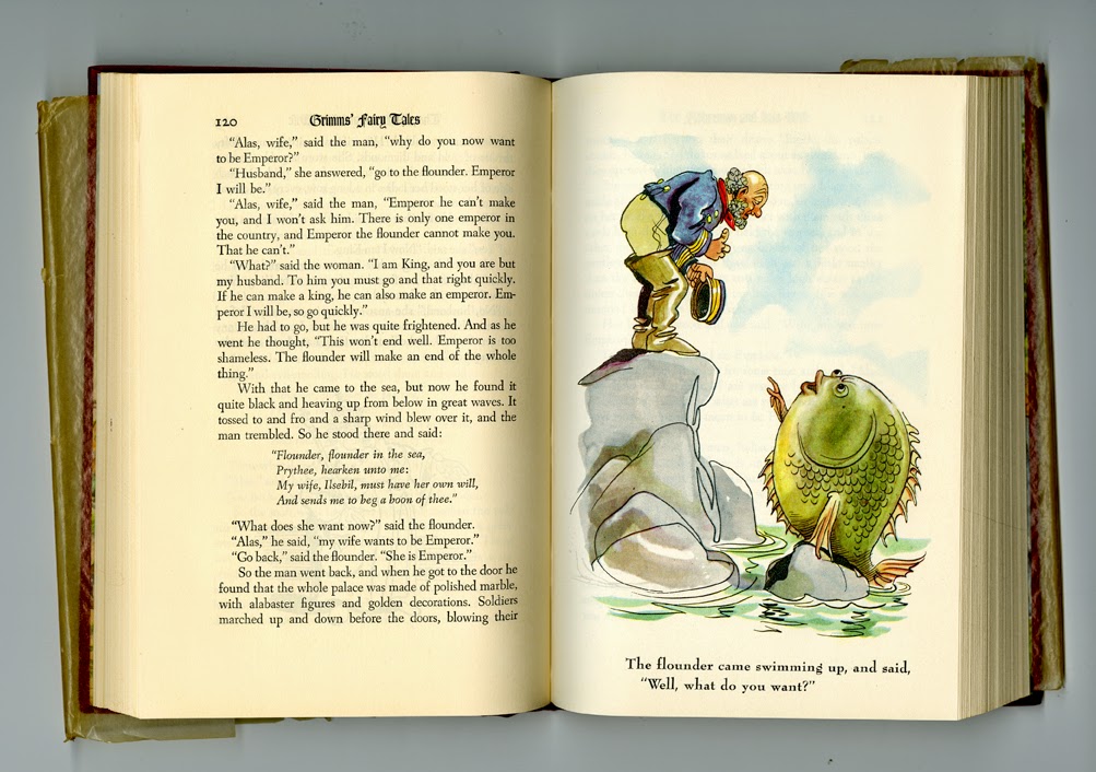
from "Grimm's Fairy Tales," illustrated by Fritz Kredel
As a child, life could be bewildering, confusing, hurtful; even terrifying. I didn't consciously realize it then, but I know now that immersing myself in fairy tales helped me to navigate the turbulent parts of my days---to integrate all those contradictory parts into a cohesive whole.
Paper Sculpture, by Su Blackwell http://www.sublackwell.co.uk/#
I am glad that my parents did not try to control what I read. I am glad that I had access to the magic, symbolism, metaphor, and mythology of uncensored fairy tales. I was too young to understand logical and intellectual explanations about life, but I could understand the messages embedded in fairy tales. Fairy tales: for me, a treasure-house of wisdom. 

Monday, December 15, 2014

ERNEST AND MARY SHEPARD

Ernest Shepard was born in December...
...and his daughter, Mary Shepard, was also born in December.

If you don't recognize their names, I hope you certainly know their work---Ernest Shepard's classic illustrations for Pooh, Piglet, and company;


and Mary Shepard's classic illustrations for Mary Poppins and the Banks family.


Not surprisingly, the two illustrators have several things in common. The work of both artists falls into the category of traditional British illustration, and both bring this style to a magnificent peak. Their penwork is masterful, and their control of this black-and-white medium is unsurpassed. It looks simple---but just try to replicate it yourself. The reason, of course, that there were so many more-than-competent artists of this media during the end of the 1800's and the first half of the 1900's is that illustrations almost always had to be reproduced in black-and-white---in other words, printed with just one color. It was usually too expensive at that time to fill a child's book, for example---which had to be marketed at a reasonable price---with four-color reproductions. Keep in mind also that newspapers, magazines, and so on were illustrated almost always with drawings, not photographs. So artists had plenty of opportunities to hone their black-and-white skills.
Illustration from "The Wind In The Willows"
 Ernest Shepard had illustrated the classic Wind in the Willows shortly before he created Pooh and his cohorts. And he would have been the illustrator of Mary Poppins as well, if the author P. L. Travers had had her way. As it turned out, he was too busy to accept the job. 
Illustration from one of the many "Mary Poppins" books
Lest you think that Mary Shepard then got the commission through some kind of pulling-of-strings by her father---not at all. P. L. After the turn-down from Ernest, Travers saw some samples of Mary's work at an exhibition, and suggested that she be the illustrator. Mary Shepard was 23 years old, fresh out of the Slade School of Art. In those days, youth was not an advantage; some people were skeptical that the inexperienced Mary could do the job. But what a happy marriage of text and art! I do think myself that, as it turned out, Mary was the better choice. The style of her illustrations wanders a bit further from reality than did Ernest's, which seems to me to suit the text admirably. And the sturdy, no-nonsense feeling of her pen line captures Poppins's character perfectly.
Illustration from "The Wind In The Willows"

I've emphasized the black and white media of these two illustrators' work. Quite some time after their books were first published, when full color reproduction had become much less expensive, many of their books were re-issued with colored illustrations. Just bear in mind that if the full-colored illustrations are what you know, they were not what earlier generations of readers saw. 


 Please do visit the two links below to see a nice group of the work of each artist. Both of them created illustrations for a variety of material, not just the famous characters they created. It's always interesting to me to see that an artist had a creative life beyond what the public generally knows about. And do try to introduce their illustrations to the children---and adults---in your life. When I Google "Winnie-the-Pooh" or "Mary Poppins", all I see are pages and pages of Disney renderings. In contrast to Disney, the Shepard interpretations of those characters are complex and satisifying, and stick well to the ribs over a long period of time. 

http://www.chrisbeetles.com/artists/shepard-ernest-howard-mc-obe-1879-1976.htm

lhttp://www.chrisbeetles.com/artists/shepard-mary-1909-2000.html


Tuesday, December 9, 2014

IS THAT TRUE?

When my son was around 4 years old, he tagged along with me as I attended a short conference on storytelling. One of the traditional tales told was The Big Toe (http://www.creativetales.net/the-big-toe#.VHuEg0vtVt0). The storyteller was quite skillful, building up the tension with increasing volume, and manipulating his voice to ominous effect. He finished up with appropriately creepy groans and the final phrase, "You've got it!"---making all of us in the audience jump in delighted surprise. James enjoyed the telling right along with the rest of us. Next came Q & A. The audience asked about storytelling techniques, how to keep your audience's attention, and so on. Then James raised his hand.

"Was that a true story?" James asked.

The storyteller thought for a moment. Then he said to James, "There are Factual Events; and there are True Stories. This story wasn't a Factual Event; but it is a True Story." 

James listened; nodded his head. He understood completely. And I have never forgotten those words of wisdom from this storyteller. Isn't that what we artists are working with, always? The True Story---which may or may not be a Factual Event.

Note: In this day and age I feel compelled to defend my parenting techniques, in case readers think that a 4-year-old should not have been exposed to a creepy telling of a creepy story. My children---who both learned to read before they were five---read anything they wanted, including gruesome Grimms Fairy Tales, gruesome Mother Goose rhymes, and all those other pieces of literature from which children today are so often protected. I often remember what James---and I, too---learned about the difference between Facts and Truths from that performance, and how succinctly and clearly it was demonstrated to him. How fortunate my son was, to learn this at such an early age.


Thursday, December 4, 2014

Tuesday, December 2, 2014

ABFFE'S HOLIDAY EBAY AUCTION


This piece is my donation to the The American Booksellers Foundation for Free Expression (ABFFE)'s Holiday eBay Auction of art from children’s books. About 80 other children's book illustrators have also donated works. The auction runs from December 1 to December 8. Proceeds of the auction help support the Kids’ Right to Read Project (KRRP), which is co-sponsored by ABFFE and the National Coalition Against Censorship. For more info, go to http://www.abffe.org.

And here is the link to join the auction directly:

http://www.ebay.com/usr/abffe

Sunday, November 30, 2014

A STONE IN THE BEANS

This morning I was preparing dried beans for baking, and found amongst them a good-sized stone. "Ah," I thought, "there must some connection between a stone in the beans, and art-making." All through breakfast I toyed with this idea. Finding a stone in the beans was like...finding a mistake in my spelling? Finding a clumsy line in my drawing? No, the stone in the bean wasn't just a mistake.  It was totally out of place. It could even be dangerous---if an unwary diner bit down on it with tooth-cracking gusto. So---the stone was like a flourescent color in a painting of pastels? Or like a brand-new character suddenly popping up at the end of a story---so jarring that an editor would reject the entire project out of hand?

Bother! I couldn't come up with anything I liked. Besides which, it was time to put the beans into the oven and sit down at my drawing board. So there's no moral or piece of wisdom attached to this posting. Except...

Sometimes a stone in the beans is . . . just a stone in the beans. 

As a consolation prize, here's my mother's baked bean recipe, slightly altered by me:

MOM'S BAKED BEANS

Soak 1 pound Maine Soldier beans overnight in plenty of water. The next morning, drain them well, discarding the soaking liquid. Cover with fresh water, bring to a boil, and simmer until the skins of the beans split when you remove a few from the pot and blow on them. Put a peeled, quartered (or chopped up, if you wish) medium-sized onion in the bottom of the bean pot. Strain out the beans from the water and add them to the pot. Pour over the top 1/4 cup maple syrup, 1/4 cup olive oil, 1 teaspoon ground mustard, and 1/4 teaspoon black pepper. Add enough hot cooking liquid to reach the top of the beans. Cover and bake for 6 hours at 300, adding boiling cooking liquid or boiling water occasionally to keep the liquid near the top of the beans. 

For Mom's version, omit the olive oil; instead lay a chunk of salt pork, fat side up, on top of the beans before you put the pot into the oven.


Monday, November 17, 2014

ETSY STORE OPEN AGAIN!

I've been so busy with book projects that I haven't yet had time to restock my Etsy Store shelves for the coming holidays. For now I've lowered prices on some "merchandise" that was left over from last year.  And I'm working on a few fun items that I hope to add in the coming days...so keep checking!

https://www.etsy.com/shop/WendyWatsonStudio?ref=hdr_shop_menu

Tuesday, November 11, 2014

JOHN STEPTOE

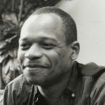
 The American author and illustrator John Steptoe was born on September 14, 1950, and died at the age of 39, in August of 1989. His birthday is not in November, obviously.  But I have been thinking a great deal about him, because I recently came across my copy of his book The Story of Jumping Mouse.

It was seeing this title when it was first published that really made me sit up and look at this author/young illustrator. I have always loved using black and white media myself; and I have a great fondness for the black and white work of other artists. It is, after all, the most basic and intimate manner in which we visual artists can communicate.

So when I opened Jumping Mouse back in 1985 and saw those gorgeous black and white images, full of energy, power, contrast, excitement---well, I was hooked. And I still am.
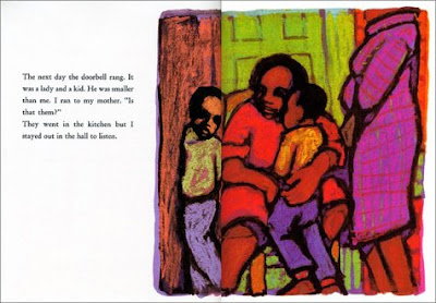
The fascinating thing about this artist is that he was so versatile and had so many ways of seeing. Would you have guessed that this brilliant, in-your-face illustration from the book Stevie was from the hand of the same artist?

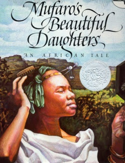
Steptoe used another completely different style for Mufaro's Beautiful Daughters.
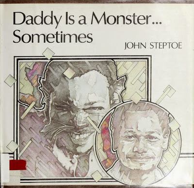
Yet another handling of images.

The publishing world, and sometimes readers as well, often want an illustrator to repeat him or herself in his work---to have a single recognizeable style. If Steptoe had lived longer, he might have begun to prefer one of his styles over others as he matured. Or he might have continued on his glorious path of constant change and unpredictability. It's unfortunate that his early death prevented us from following his career and work for a longer time. But we are fortunate indeed to have had him for as long as we did.  

http://en.wikipedia.org/wiki/John_Steptoe

http://www.johnsteptoe.com

Tuesday, October 14, 2014

FOUND KEYS

My lost keys are now found keys. A friend was helping me straighten up my house; when she picked up a garment that had been lying in a chair for...well, weeks...there lay the keys underneath. (Probably fallen out of a pants pocket.) I had searched every place I could think of (except under a tossed-aside sweater, obviously).  I was sure they would never be found. NEVER. I had given up completely on them. Yet they were found, finally. And not even in some exotic location; just in a place that I hadn't been able to imagine as a hiding spot.

How like this is, again, to finding the key to a writing problem or knot. I wrack my brains, try out every possible solution in my mind, brain storm until I am stormed out.  It seems obvious: I will never find the solution. NEVER. I give up on it totally, and go on to something else. And then the solution pops into my mind at some unexpected moment. A solution that now seems obvious and simple---yet I hadn't been able to imagine it on my own.

Muses, and Friends: I can't imagine life without them.

Tuesday, September 30, 2014

LOST KEYS

I misplaced my keyring---with keys to house and car---a day or two ago. I knew they had to be somewhere on my property. I would not have been able to get back into my house without them. I have duplicates to all my keys, and was not really inconvenienced, but I became obsessed: looking in the same places over and over, convinced that the fiftieth time around, the keys would be where, on the forty-ninth time around, they hadn't been. Soon there was a path marked out on the carpet of the route I was travelling...again...and again...and again. What is that definition of insanity?  Doing the same thing over and over, and expecting different results?  
Suddenly I caught myself.  I realized that this is exactly how I often begin when I can't find the keys to a knot in a manuscript or a sketch dummy on which I'm working.  But I've learned that the obsessive approach is not a productive approach. If I can calm down, open my heart, relax my mind, the key to the creative problem will usually appear of its own accord...on its own timetable, of course.
Can I apply this same principle to finding my house and car keys?  Free up my mind, meditate, in the hope that the location of that elusive key ring will float to the surface?  Well, I can try...though so far, I have to admit, it hasn't worked. 

Tuesday, September 16, 2014

INGRI AND EDGAR D'AULAIRE

Edgar d'Aulaire was born on September 30, 1898 in Germany. In the children's book world, though, we think not of Edgar on his own, but of Edgar and his wife Ingri d'Aulaire (who was born on December 27, 1904). 
Working together as children's book illustrators, they were one of the most compelling artistic teams I've ever seen in children's books. In fact one of the most compelling illustrators, period, whether a team or solo.

Their work is unique, distinctly their own, immediately recognizable. Their book of Greek myths was one of my earliest introductions to their work.

They were especially interested in folklore and myth.

Norwegian tales of trolls, gods, and goddesses filled many of their books.


Later, after they had emigrated to the United States, they turned their attention to American folklore and American heroic figures, like Pocahontas and Ben Franklin.

Their work is sturdy and full of vitality; it feels very physical. 
Yet at the same time it is delicate and poetic, full of dream-like images and imaginative wanderings.
Indulge yourself---look up some of the books created by this spectacular pair, and take flight!

http://en.wikipedia.org/wiki/Ingri_and_Edgar_Parin_d'Aulaire

Tuesday, September 9, 2014

RETREAT, RENEW, RECHARGE

July and August in Vermont.  What I didn't have: Easy access to the Internet. Enough forks and spoons. Or pots and pans. 
Furniture. A washer or dryer.
What I did have: A tiny toad in the back yard on dew-laden mornings.
N. C. Wyeth thunderstorm skies.
A birthday table, with dear friends.
A double rainbow of hope, the day before I left.
And when I returned to my Phoenix studio? A sudden deluge of creativity.

Sunday, June 29, 2014

FRANCES ISABELLE BRUNDAGE and LYND WARD

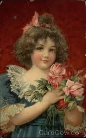
Though you may not know her name (I did not until I did my research for this post) you certainly are familiar with her work.  She was France Isabelle Brundage, born June 1854: creator of so many of those sweet Victorian images floating through our Victoriana-hungry culture.
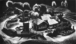
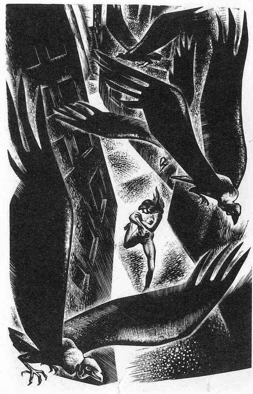
You perhaps are more likely to know of Lynd Ward, born in June 1905: illustrator of some of our best-known children's books:  The Biggest Bear; Johnny Tremain; The Little Red Lighthouse and The Great Gray Bridge.

I am grouping these two illustrators in one post for a couple of reasons.  First, I wanted to highlight the incredibly wide range of artistic expression found in children's books. This variety is present not just in contemporary books; it is there as well in books from earlier generations.


I confess that the images I'm posting do not show the dramatic differences between these two illustrator's styles that I'm wanting to highlight! though the differences become quite clear when one looks at the bodies of work of both, and considers the subject matter of the two. But there's another reason I am grouping these two illustrators together: they both had at least one other side to their work.  
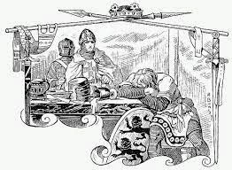
Brundage illustrated classic works for children in a style quite different from her sweet Victoriana---illustrations that are not familiar to today's audiences.
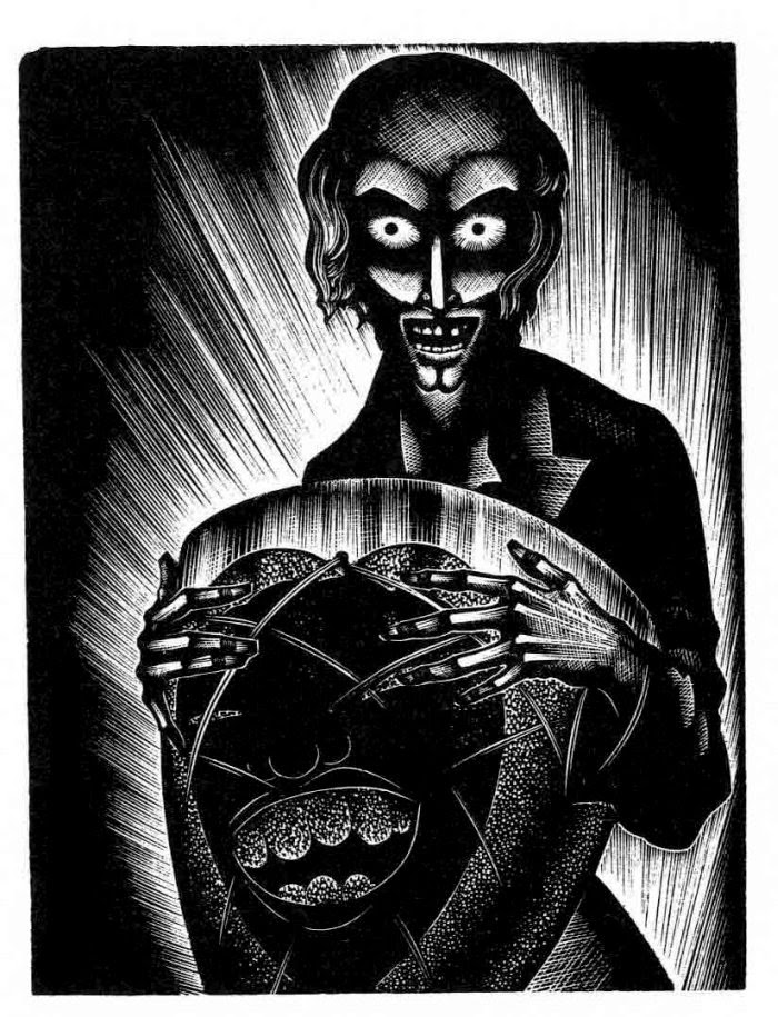
And Lynd Ward---considered a precursor and mentor of the modern gothic novel---created a body of tortuous, nightmarish images that is far removed in content from his work for his younger children's books. In fact it was difficult to find pieces from one of his wordless books that I could comfortably post on this family-friendly blog. 
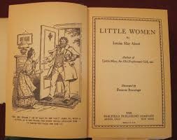
The reality is that children's book illustrators---like all artists---express their creativity in multiple forms: some pleasant, some unpleasant, some, perhaps, downright horrible. But why should that be surprising?  Artists, children's book illustrators included, are simply expressing visually, for the rest of us, the complexity of being a human being. I urge you to do your own research into the work of both of these outstanding artists. As for the layout of this post, and my valiant attempts to make it legible for my readers---Blogger, I concede defeat.  You have won---but only for the moment---in this battle of graphic design.


http://en.wikipedia.org/wiki/Lynd_Ward
http://en.wikipedia.org/wiki/Frances_Brundage